Since graduating from the University of Manchester with a degree in Physics, I have worked as a developer on a range of machine learning projects using Python and out of my own personal interest I have also been learning SQL as well as front-end web development. I'm a naturally curious, adaptable person who has worked independently on projects, within teams and, on occassion, assisted with managing projects as well. I am a quick learner and an excellent communicator too, and have written reports and given presentations aimed at people from all sorts of backgrounds and levels, both technical and non-technical.
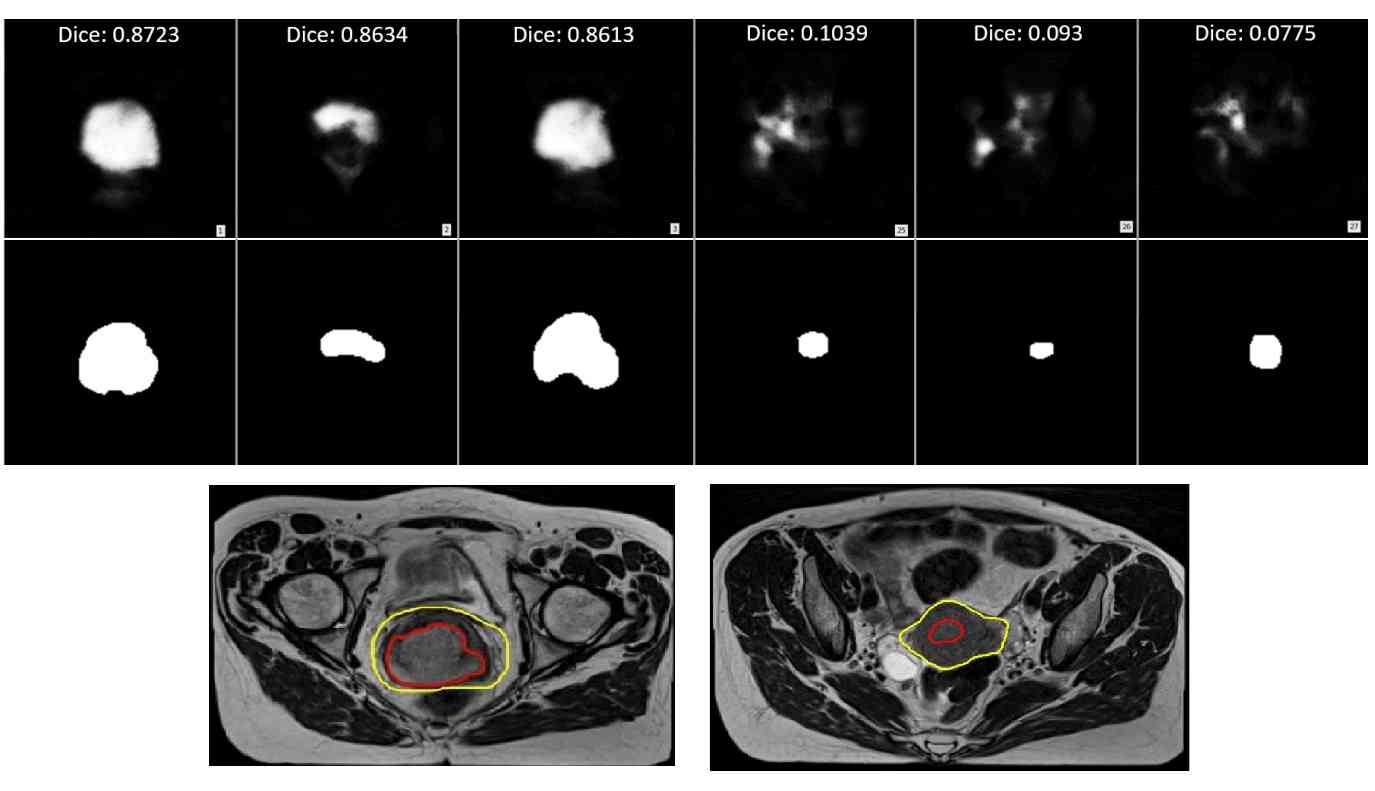
This was my Master's project conducted at the University of Manchester with collaboration with The Christie NHS Foundation Trust. The first part involved setting up a project pipeline to read in MRI image files (in NIfTI file format), pre-process them and storing these images. These were then used for large feature extraction using a package called radiomics.
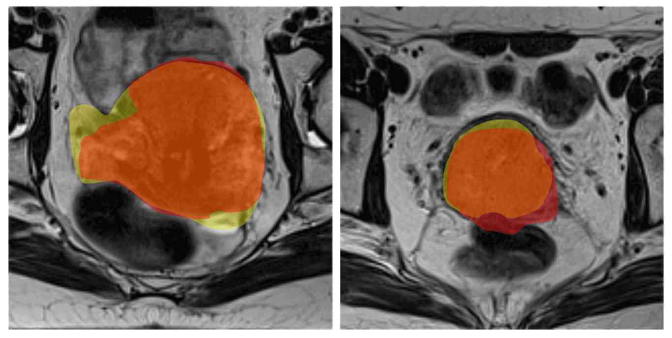
The second part involved using the above pipeline, and a U-Net style convolutional neural network (CNN) to employ deep learning; this was used to segment two main defined cancerous regions - the gross tumour volume (GTV) which indicates the visible, macroscopic spread, and clinical tumour volume (CTV), which includes the GTV plus some of the surrounding area (containing possible microscopic spread).
GTV segmentation had also never done before using deep learning for cervical cancer at the time. The technique employed transfer learning using the ImageNet database (due to the limited size of the dataset of cervical cancer images) and in the end, accuracies of 55-80% were obtained in identifying the correct GTV/CTV regions. This project was predominantly Python-based though some MATLAB and Lua code had to be written as well. For future work, it would also be possible to repeat this technique on other sets of clinical images.
Top figure and video shows the contours predicted for the GTV regions of a test MRI dataset. The DICE coefficients calculated indicate level of overlap between predictions and actual delineations with a value of 1 indicating maximum overlap. Middle figure shows the GTV (red) and CTV (yellow) delineations used for training. Bottom figure shows the overlap between the predictions (orange) and real (yellow) for the CTV region.
This project involved reviewing techniques in generating synthetic data, driven by the need of sharing sensitive data for R&D purposes. The synthetic data generation tools aimed to mimic characteristics of the real dataset whilst removing or obscuring the sensitive information present within the real data. The final report was made public here on Gov.UK.
For example, we might want the synthetic data to retain the range of values of the original data with similar (but not the same) outliers. Or we might want to retain a similar frequency distribution in the synthetic and original datasets. However, this becomes more complex when we start to consider interactions between fields, or different types of data such as free text and GPS locations.
Working in a team, I helped explore public datasets which were similar to those used by the customer and identified tools which could be used to produce synthetic data. For example, the Czech financial database comprised of numerical/categorical data was used with the Synthetic Data Vault (sdv) Python package whilst the text-based resumes/CSVs were used with Microsoft's open-source tool called "Presidio" (which was also powered by AI algorithms).
SDV worked with relational tables and from the testing and analysi using cross-correlation heat maps and histograms, the tool produced mixed results since it only seemed to work with Gaussian-distirbuted data. This often led to odd results such as negative bank ID values - however, since the tool is open-source, it's still currently in development and the ability to specify other distributions may be added in at a later date.
The final report can be viewed here on Gov.UK here, whilst a blog article regarding this investigation can be found here.
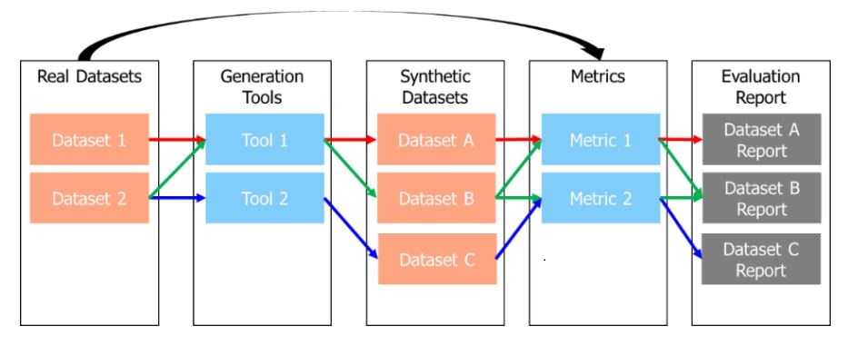
Figure shows the summary of approach indicating the components and data flow (coloured arrows), as well showing how the synthetically-generated data is evaluated.
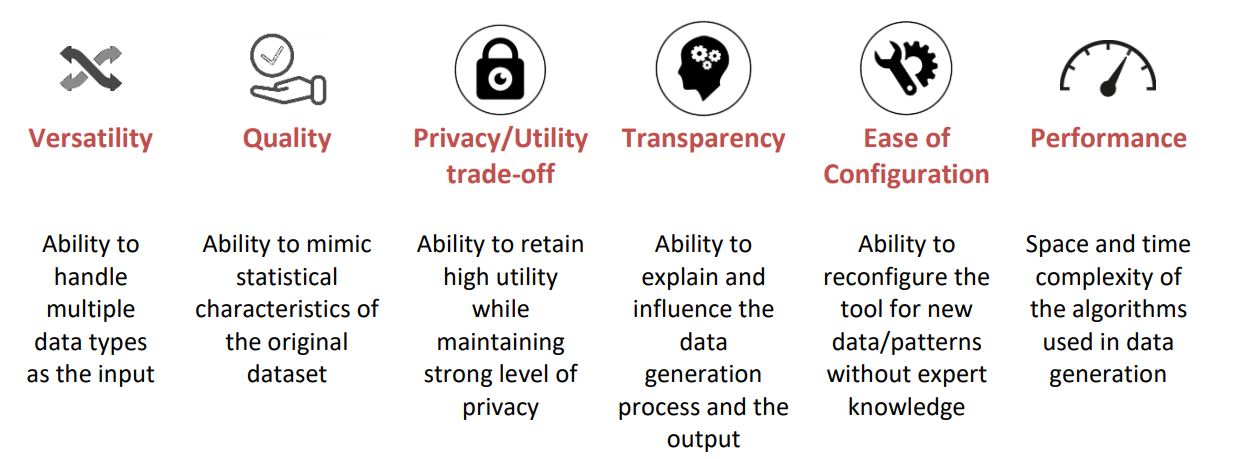
This figure shows the evaluation framework for synthetic data generators, consisting of six indicators.
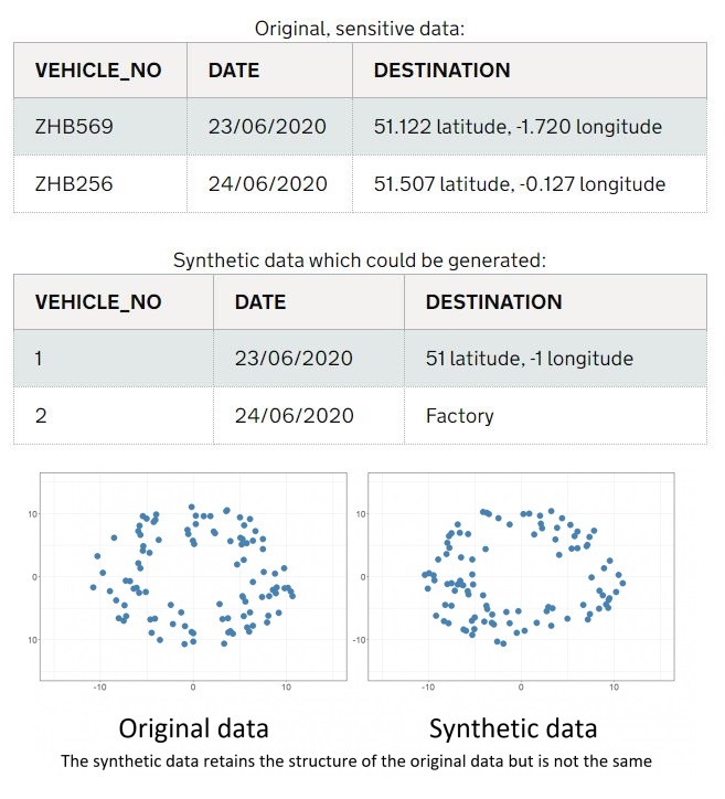
A comparison of how original, sensitive data would compare to synthetically-generated data.
For details of other projects, please contact me using the email below.
An interactive Wordpress website built by producing a custom theme for a fictional university.
My Github portfolio for my web development and data science projects, which uses the Bootstrap framework.
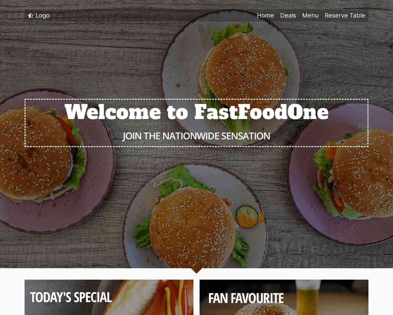
A fast food restaurant website which also has table reservations.
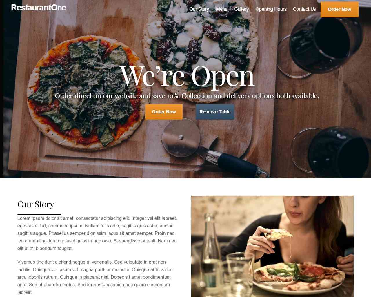
A restaurant website which allows for table reservations and online delivery.
Click one of the buttons below if you wish to contact me or please send an email to brijp019@gmail.com.